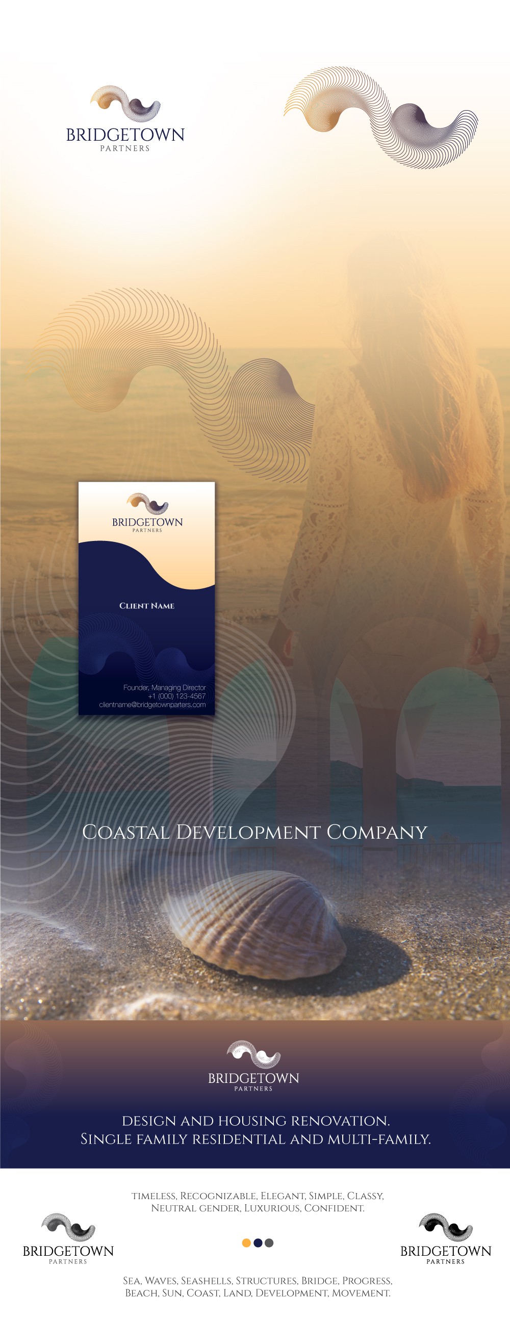
A timeless mark for a coastal development company

2
Created on 99designs by Vista
This luxury mark was build with the thought of waves and sea, structures, coast, land, movement, development, moving forward. The typography used is Montserrat Alternative, it's delicate lines go according to its icon. It has a dream like aesthetic that let you imagine the breeze of the ocean while you are in the shoreline. Colors blue and yellow are applied because together conveys intelligence, security and flexibility. The gradient used brings added movement and luxury to this composition.