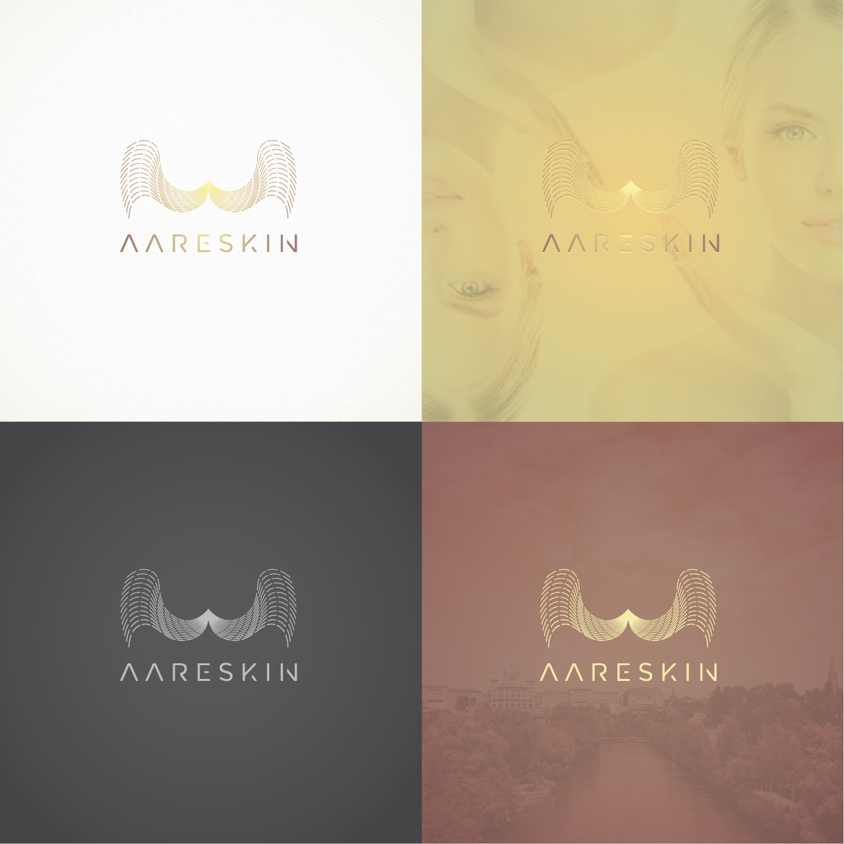

This luxury mark was build with the thought of a top service, its aesthetic invites to imagine that your are gonna be served with satisfaction and quality. It is memorable and timeless and want it to be intriguing in order to stay in the mind of costumers. Overall it is shown like spanned wings to convey that it is a welcoming and secure place where we go to heal ourselves. The wavey lines are generated from the center of the icon, it shapes an A letter from the brandname. It has an organic feeling to it to let people know it is safe. The typography used is custom made, it's delicate lines go according to its icon. It has a dream like aesthetic that let you imagine that you are gonna have a great service and be satisfied with the high quality of treatments in the center. Colors yellow and taupe are applied because together conveys knowledge, security, exclusivity and sophistication. The gradient used brings added movement and luxury to this composition.