
Created on 99designs by Vista
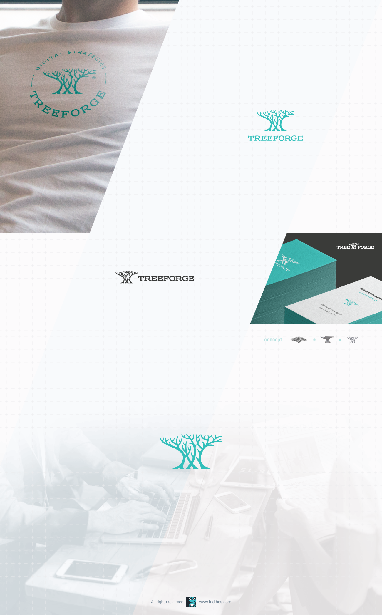
For this digital marketing and product development startup, company name is derived from partner's names, and therefore both concepts in TreeForge were equally important in brand design development. We settled with this amazingly simple yet clever logo merging the concepts in anvil-like tree design. Monochrome and flat, featuring neat green-blue shade and lettering with a statement, this logo was a base for full brand identity both me and clients were happy with.