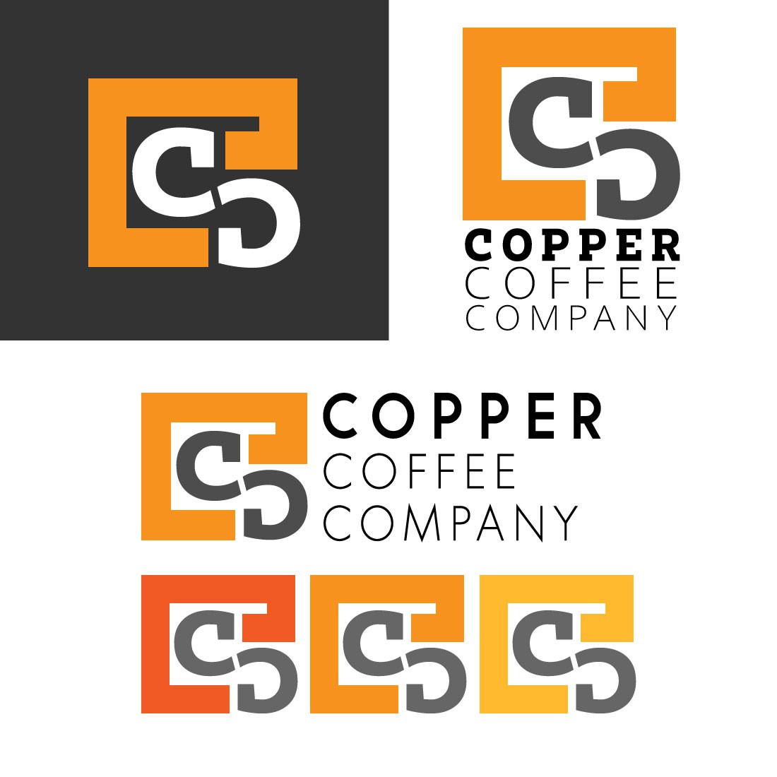
Modern Minimalist Logo for Copper Coffee Company

0
Created on 99designs by Vista
Description:
The design is for Copper Coffee Company which is modern and geometric according to the requirements of the client.
Interpretation of the Logo:
The logo features two C. One C is inside the box and the other one is inverted. The box is drawn to show professionalism and the fit, goal seeker factor.
Color Scheme:
Grey and Orange colors are used which can be varied according to the taste of the client.
Why this Logo:
It shows the brand as luxurious and top class. It features the proper coloring to portray the brand as classy, luxurious, modern and graceful.