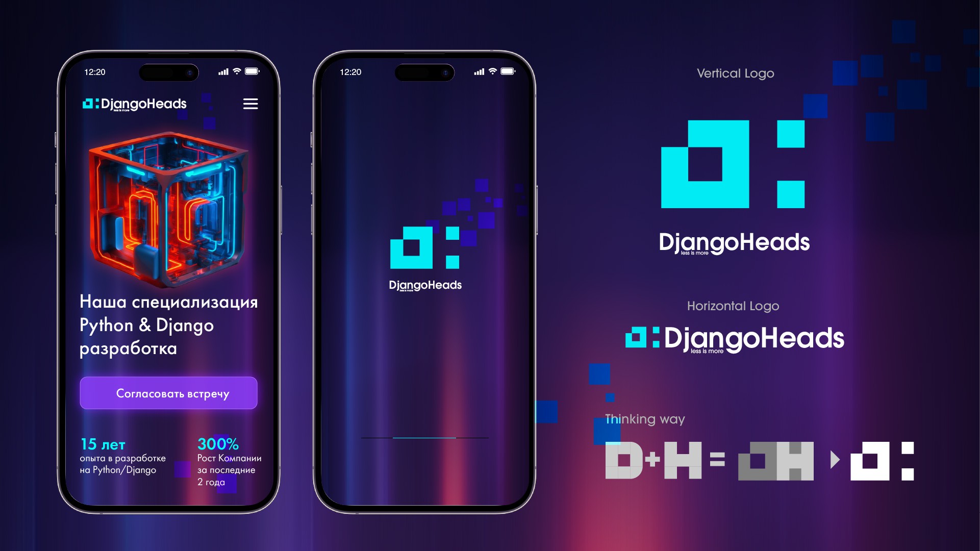
The logo should be simple and shrink to the size of an icon without losing readability. The pixel style was the best fit. D made from pixels H created from negative space