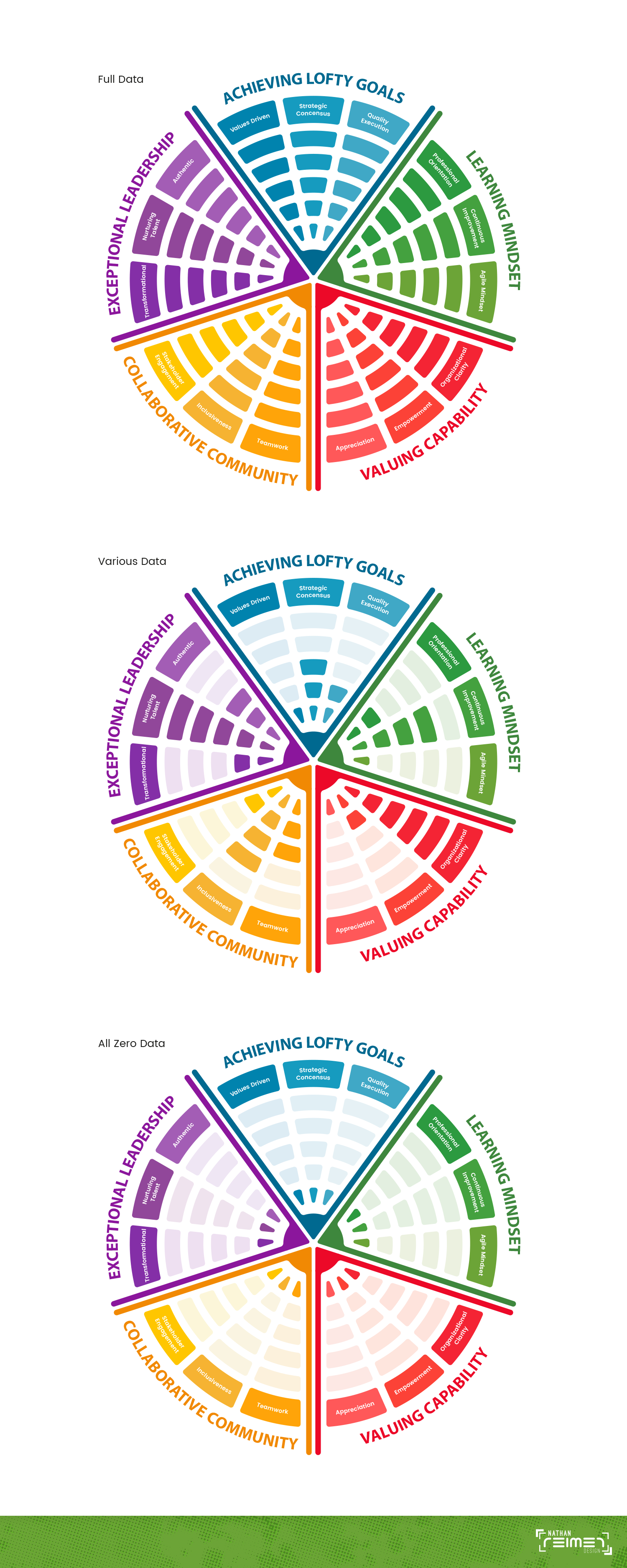
Circumplex Survey Diagram

0
Created on 99designs by Vista
The circumplex was the desired diagram choice to display the survey data, so I decided to break up the diagram into sections based on the main categories with each sub-category in a shade of the same color to help distinguish between each section.