Hexagonal logo of letter "BC" for BlueCube

34
Created on 99designs by Vista
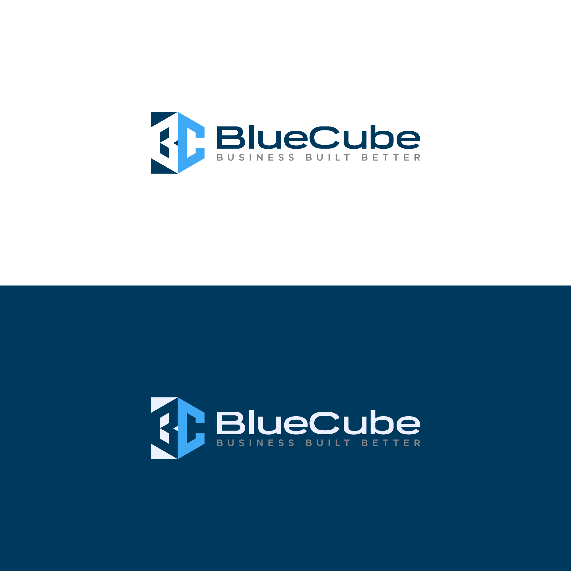
The icon is a stylized combination of the letters B and C, cleverly integrated to form a three-dimensional cube shape.
The cube symbolizes structure, stability, and efficiency, aligning with the tagline "Business Built Better"—suggesting robust business solutions.
The blue color gradient adds depth, giving a sleek and tech-savvy look while maintaining trust and professionalism, commonly associated with blue tones.