
Created on 99designs by Vista
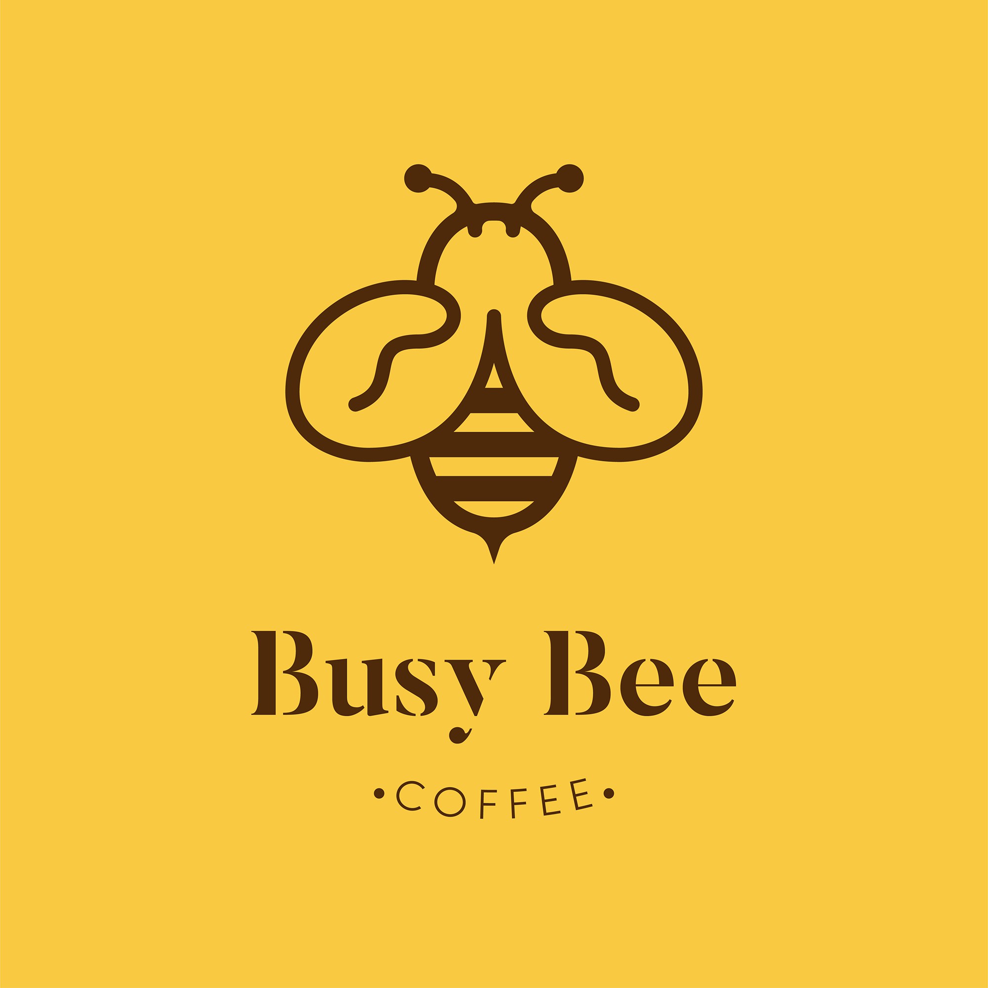
In this logo design,
I have combined the bee element with coffee beans as its wings on the icon.
Icon is designed simple and clean.
A masculine serif font is chosen to be used on the text "busy bee" in order
to drag attention to your audience and also leave a "strong" impression
of your brand to the people.
Simple and clear serif font is used on the text "Coffee" to give a clear idea of
what is the brand about.
Color used are the combination of dark brown and bright yellow which deliver
a visual that brings a big impact and contrast.
Dark brown represents the color of coffee where as the yellow color represents the busy bee.
Minor amendment are allowed to be made to fit your interest.